Keeping Drivers Safe
Designing a Tire Lifecycle Tracker
Better Than an Ad
A popular auto parts retailer was working on a complete redesign of their online experience and wanted a way to encourage repeat customers as well as set itself apart from competitors in the digital space.
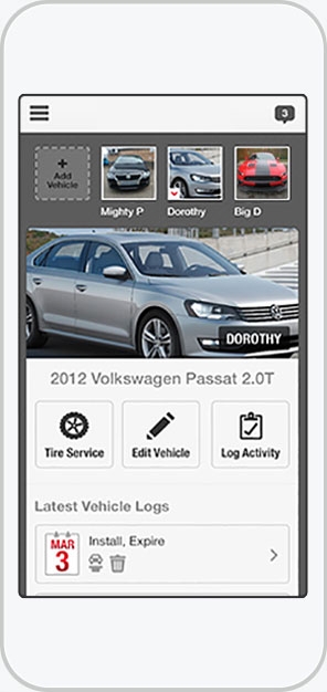
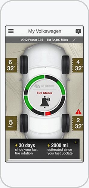
They had the idea for a mobile app that would allow customers to track the lifecycle of their tires and help avoid dangerous blow-outs.
High-Fidelity Wireframes
Make It Quick
This was one of those clients that had a clear idea of what they wanted but didn’t know how to execute it.
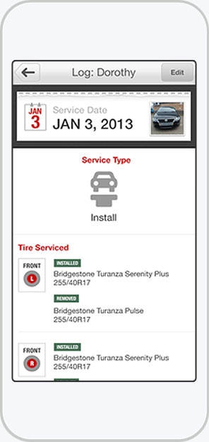
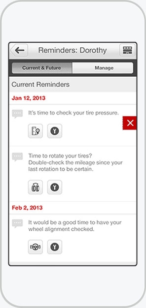
As they explained it, a user would purchase a set of tires, enter information about the tires and vehicle, and by tracking mileage, the app would be able to estimate wear and tear. They also wanted to include push notifications to perform routine tire maintenance such as balancing and rotating.
To add to the pressure, they had a tight deadline: they wanted to release the app alongside their updated website.
Prototype Animation
Make It Move
Their big concern was making it as intuitive as possible for the wide range of users they were targeting (that is, anyone who buys tires). It needed to be straightforward and honest, not clever.
In testing, we found that that animation and visual feedback were crucial in orienting and guiding less tech savvy users.
“Whether or not a client chooses to follow my advice, it's my job to make sure they're making an informed decision.”
What I'd Do Differently
Most of the design process was invested in the tire condition tracking feature, but the client continued to request additional features throughout the process.
Telling a client "no" can be touchy and knowing when to push and when to back off is a learned art. I was confident that adding additional features so late in the process was a bad idea, and I think I could have done more to educate the client.
Whether or not a client chooses to follow my advice, it's my job to make sure they're making an informed decision.


