Bringing Analytics to Retail
Designing a Retail Analytics Platform
Who, What, Why
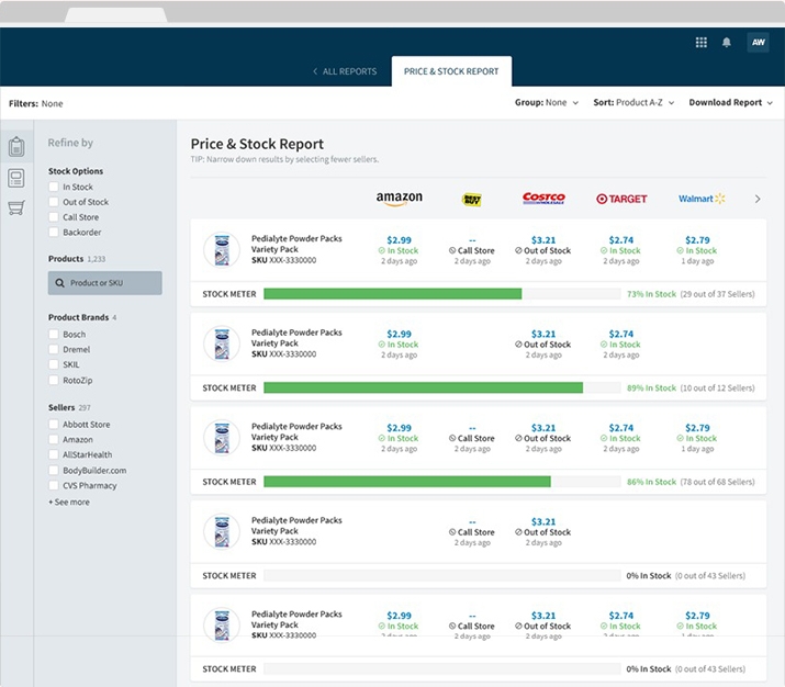
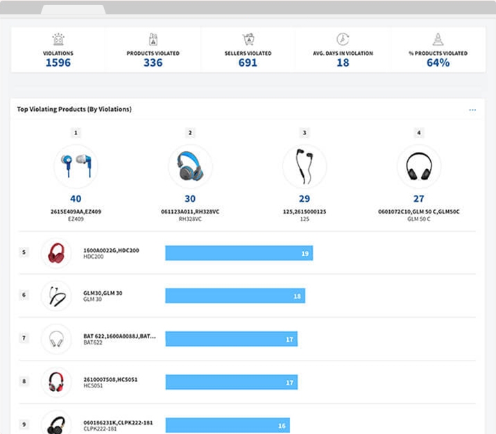
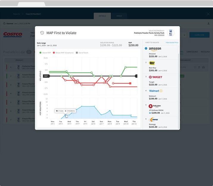
You’re probably wondering what exactly a retail analytics platform does. The short answer is that it allows manufacturers to see exactly how and where products are sold as well as pricing, product descriptions, images, and advertising across retailers.
In other words, it gives manufacturers a bird’s eye view of their business.
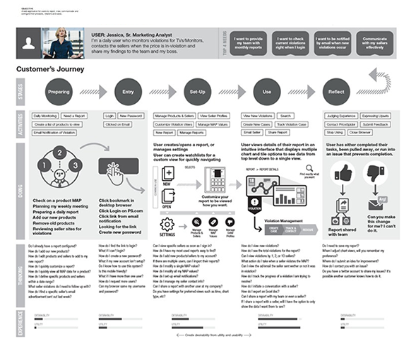
User Personas and Experience Map
The Best Tool Nobody Used
The big problem with the current state of the application was that less than 5% of registered accounts were active. After talking to users, the key complaint was that the software was too time consuming to use regularly. It also turned out that the active accounts were primarily power users—familiar enough with the software to be efficient with it despite its flaws.
I also wanted to bring the product team into the UX process and work on establishing best practices going forward. Their current approach to design was more like a scrappy start-up with minimal research and testing than an established company, and the in-house designers were starting to feel like they were on a wild goose chase.
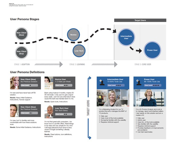
Unlike their current trial-and-error approach to MVPs, we first developed a content model, user personas, and experience map that would guide the rest of the process.
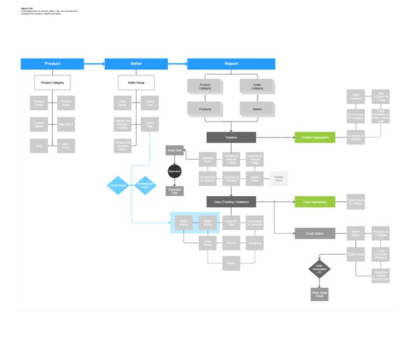
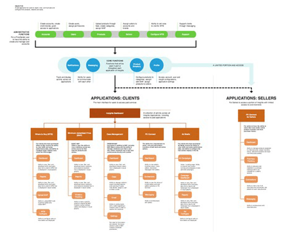
Original and Revised Information Architecture
Back to Square One
You never really know what you’re dealing with until you’re in the thick of it.
After early testing with users, we realized a single application wasn’t the way to go. The software was just too bloated. Instead, we decided to separate them into a suite of individual tools.
Of course, that meant a complete overhaul of the information architecture.
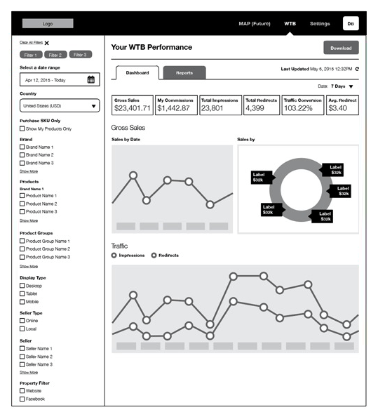
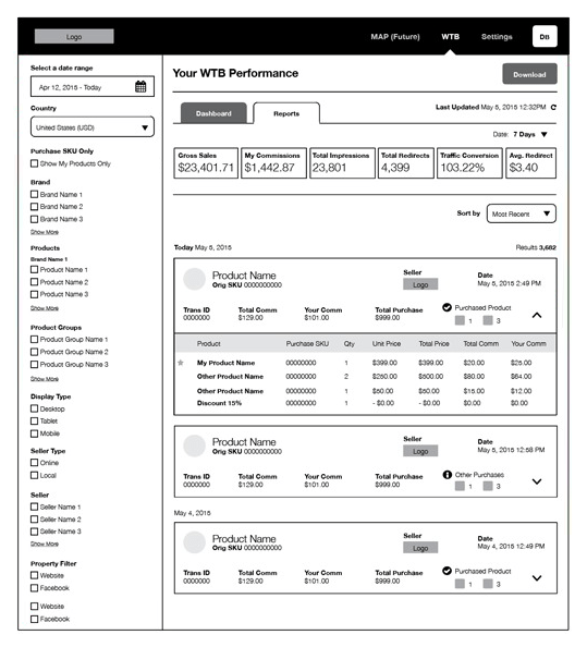
Wireframing the "Where to Buy" Application
Quick and Painless Testing
User testing was central to the process every step of the way—from the information architecture to wireframes and interactive prototypes.
With the goal of developing an efficient, sustainable UX process in mind, most testing was done remotely with in-person testing sessions held at key milestones.
“If you want to keep users, you need to show them that their continued support is valued.”
What I'd Do Differently
With the rollout of the new design, engagement shot up. Of course, as expected, there were complaints from existing users—almost impossible to avoid with any redesign, but considering the complete restructuring of the software, I think we could have done more to ease that transition.
If you want to keep users, you need to show them that their continued support is valued.

