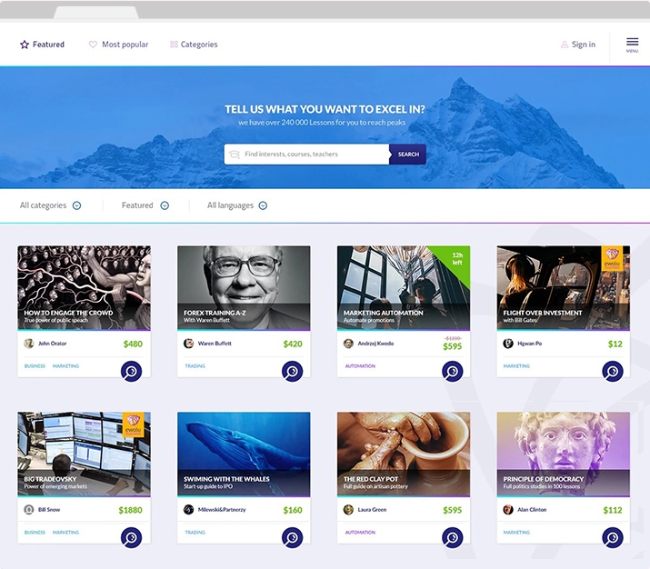
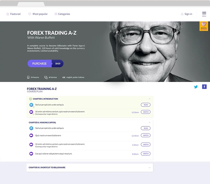
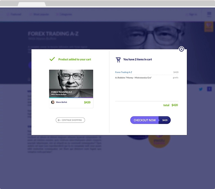
Making Education Accessible
Designing an eLearning Marketplace
The Infinite List of Features
An online education startup was looking to pivot from producing online courses to offering a platform for people to sell their own.
When I was first brought in, I was given a long list of features without a clear vision for the product. All they knew was that they wanted to help online educators expand their audience and open up access to affordable online education.
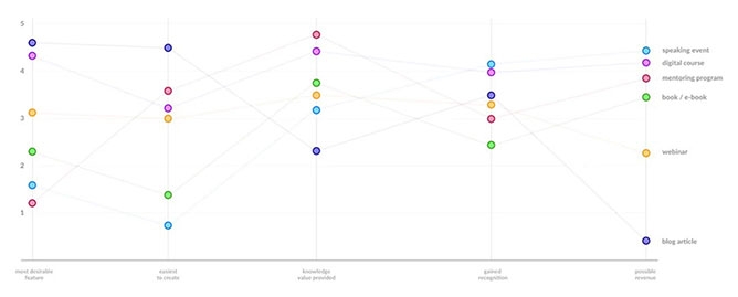
Priority Matrix
Focusing on Goals
The first step was to shift the focus from features to user goals. How might an educator reach a wider audience? What could help them build their brand?
Translating those goals into possible features and services, I developed impact maps for the two primary user groups: educators and students. With that, we were able to easily pick the top candidates for design sprints.
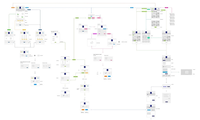
Flow Diagram
Test and Test Again
From there, I started testing and iterating on wireframes and establishing a clear user flow. With both groups of users being equally important to the success of the product, it was crucial that we test both with every iteration.
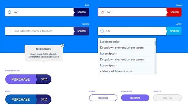
Styleguide Sample
Make It Scalable
Working with the in-house design team, we developed a design library and style guide. With such a small team and limited budget going forward, I knew future updates and maintenance needed to be as efficient as possible.
“No amount of research or testing can match putting a product out into the real world.”
What I'd Do Differently
As is often the case with contract work, my involvement was over as soon the product went into development, and it always feels like stopping short of the finish line. No amount of research or testing can match putting a product out into the real world.
Granted, there's only so much you can do within a given budget and timeframe, but I think being able to iterate again after the product was live would have been incredibly valuable, and it's a conversation I wish I'd had.
